Ken Thomas is an Interdisciplinary Designer and Creative Strategist crafting narrative-led brand experiences across digital, visual, and cultural spaces.
Ken Thomas is an
Interdisciplinary Designer and Creative Strategist crafting narrative-led brand experiences across digital, visual, and cultural spaces.
Unbound Sound
Identity, Strategy
,
2024
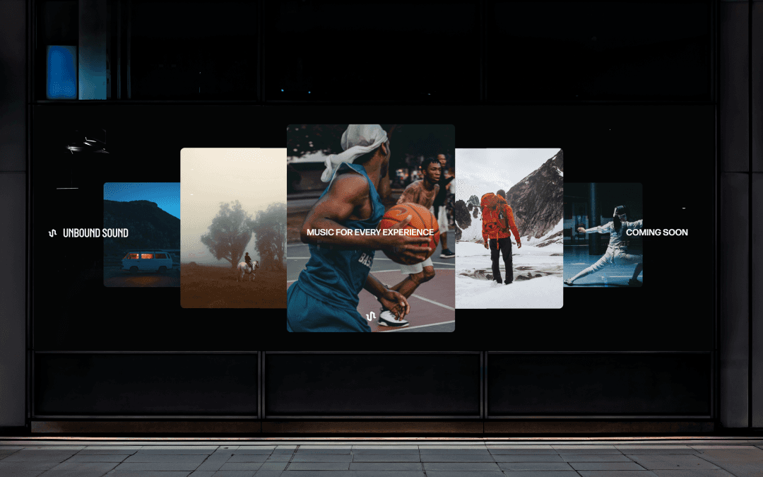
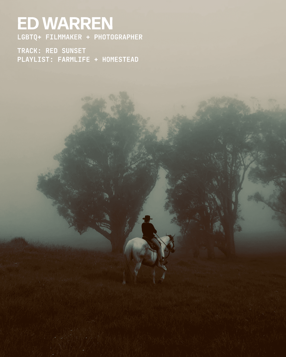
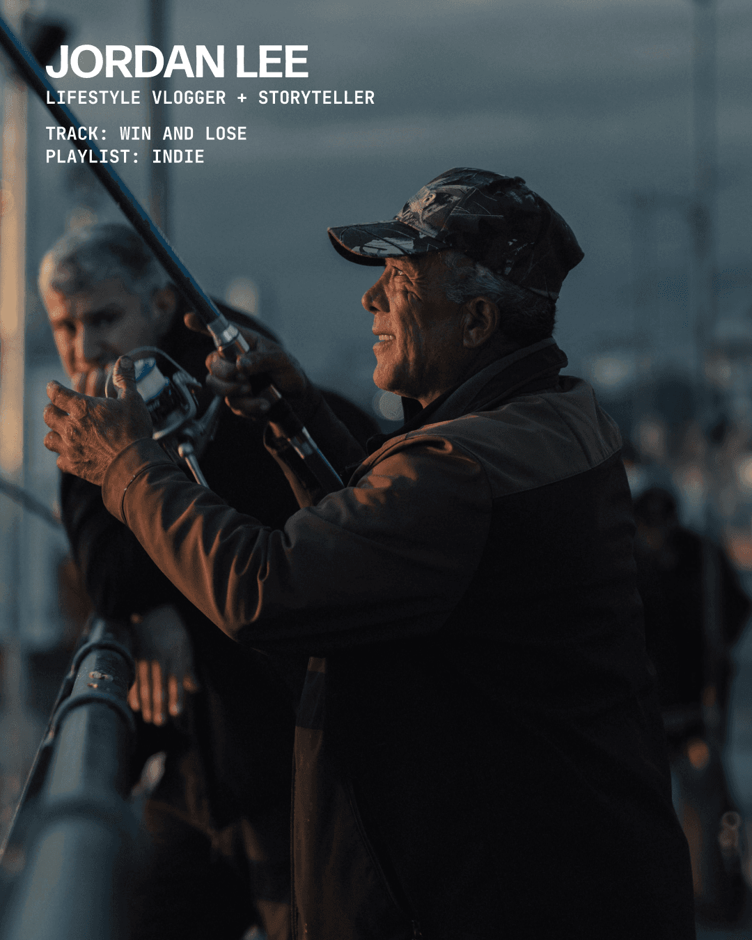
Client Unbound Sound is a women, POC, and LGBTQ+ led boutique music library built for creatives by creatives, providing label-quality tracks for artists, content creators, brands, producers, and composers. Category: Brand Development, Creative Direction, Campaign Development, Digital Design, Motion Role: Lead Designer Team: Empty Cart Studios Project Overview We partnered with Unbound Sound to amplify their brand identity and develop a motion-first, pre-launch campaign that positioned them as a next-generation music platform. The goal: drive engagement, grow awareness, and create a visual system that speaks directly to creators across mediums. Design Thinking Unbound Sound needed an identity that didn’t just represent music, but immersed users in it. We responded with a motion-forward visual design system built around the idea of “music for every experience,” using panoramic, zoom, and revolving layouts to evoke movement, depth, and immersion. The system was flexible and dynamic, tailored to fit creators ranging from cinematic videographers to everyday influencers. It unified every brand touchpoint, from aspirational social content to digital collateral, into one cohesive experience. The strategy seamlessly fused design and marketing: every asset served a purpose, carried a tone, and sparked connection with Unbound Sound’s audience of modern creators. Results 30+ custom-designed assets posted 32% increase in social media following 20%+ engagement rate on 15% of campaign posts Delivered strategy documentation and action steps for sustained growth
UNB_01.jpg
UNB_02.mp4
UNB_03.jpg
UNB_04.mp4
UNB_05.jpg
UNB_06.jpg
UNB_07.jpg
UNB_08.jpg
UNB_09.jpg
UNB_10.mp4
Unbound Sound
Identity, Strategy
,
2024
Client Unbound Sound is a women, POC, and LGBTQ+ led boutique music library built for creatives by creatives, providing label-quality tracks for artists, content creators, brands, producers, and composers. Category: Brand Development, Creative Direction, Campaign Development, Digital Design, Motion Role: Lead Designer Team: Empty Cart Studios Project Overview We partnered with Unbound Sound to amplify their brand identity and develop a motion-first, pre-launch campaign that positioned them as a next-generation music platform. The goal: drive engagement, grow awareness, and create a visual system that speaks directly to creators across mediums. Design Thinking Unbound Sound needed an identity that didn’t just represent music, but immersed users in it. We responded with a motion-forward visual design system built around the idea of “music for every experience,” using panoramic, zoom, and revolving layouts to evoke movement, depth, and immersion. The system was flexible and dynamic, tailored to fit creators ranging from cinematic videographers to everyday influencers. It unified every brand touchpoint, from aspirational social content to digital collateral, into one cohesive experience. The strategy seamlessly fused design and marketing: every asset served a purpose, carried a tone, and sparked connection with Unbound Sound’s audience of modern creators. Results 30+ custom-designed assets posted 32% increase in social media following 20%+ engagement rate on 15% of campaign posts Delivered strategy documentation and action steps for sustained growth
UNB_01.jpg
UNB_02.mp4
UNB_03.jpg
UNB_04.mp4
UNB_05.jpg
UNB_06.jpg
UNB_07.jpg
UNB_08.jpg
UNB_09.jpg
UNB_10.mp4
Thimble
Direction, Digital
,
2023
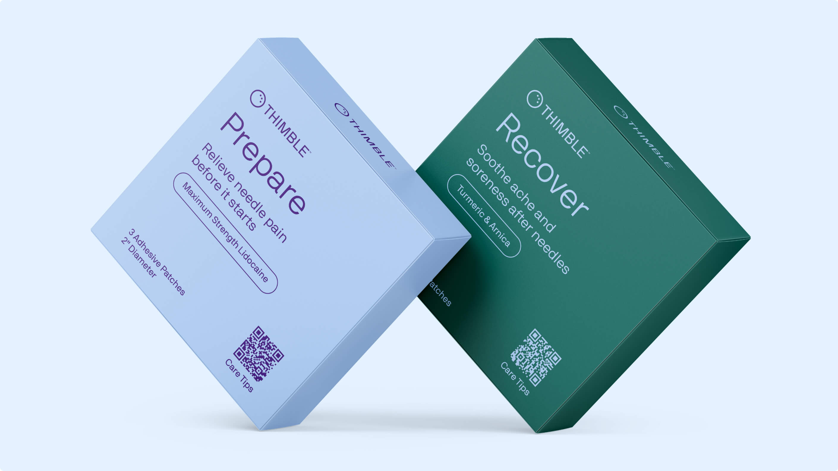
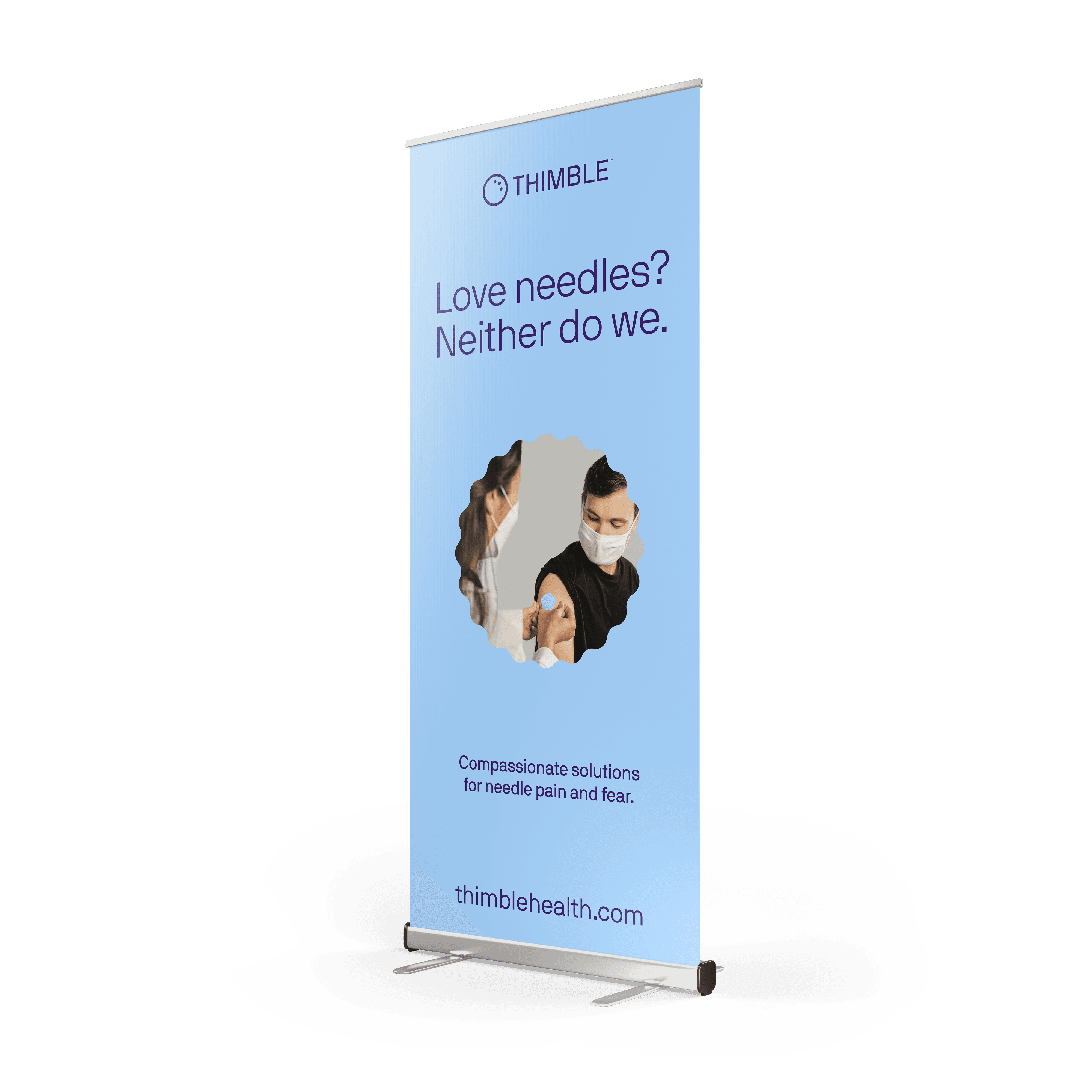
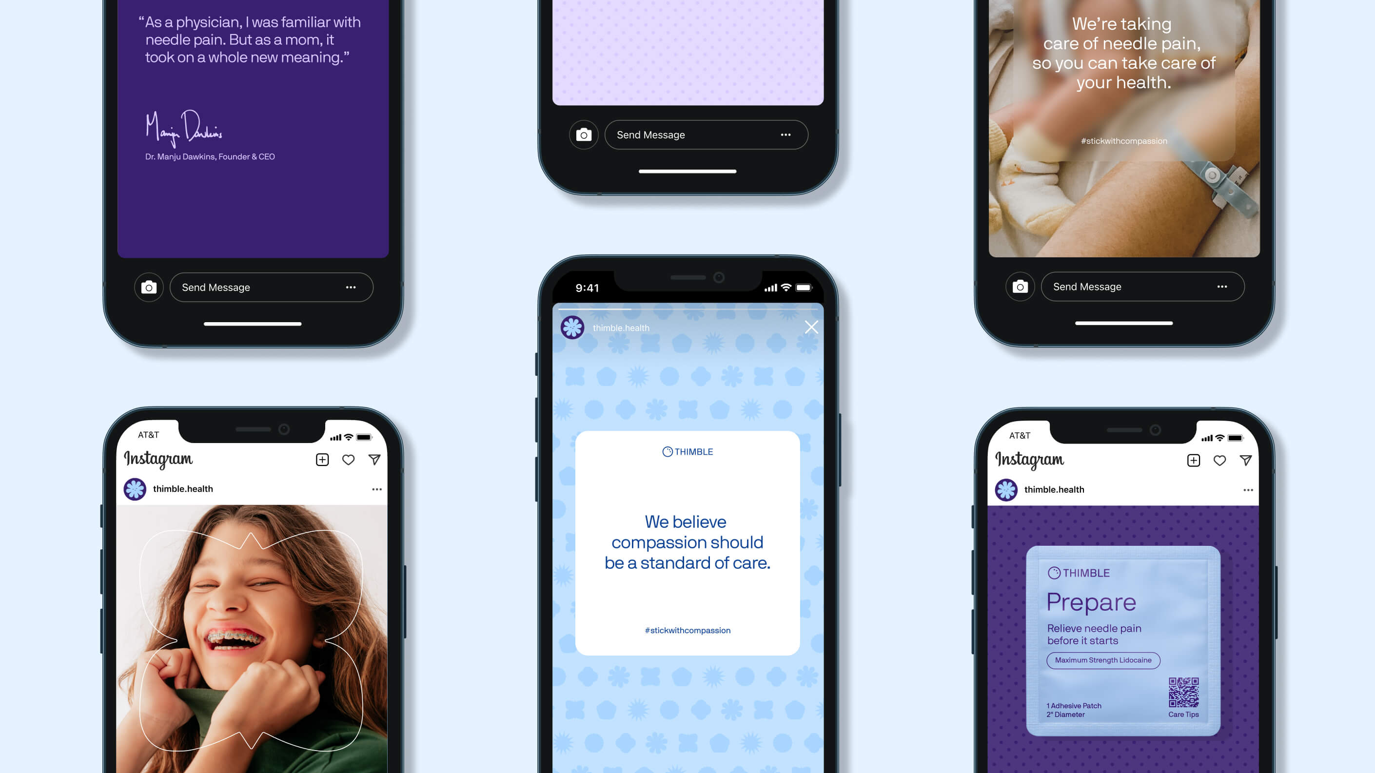
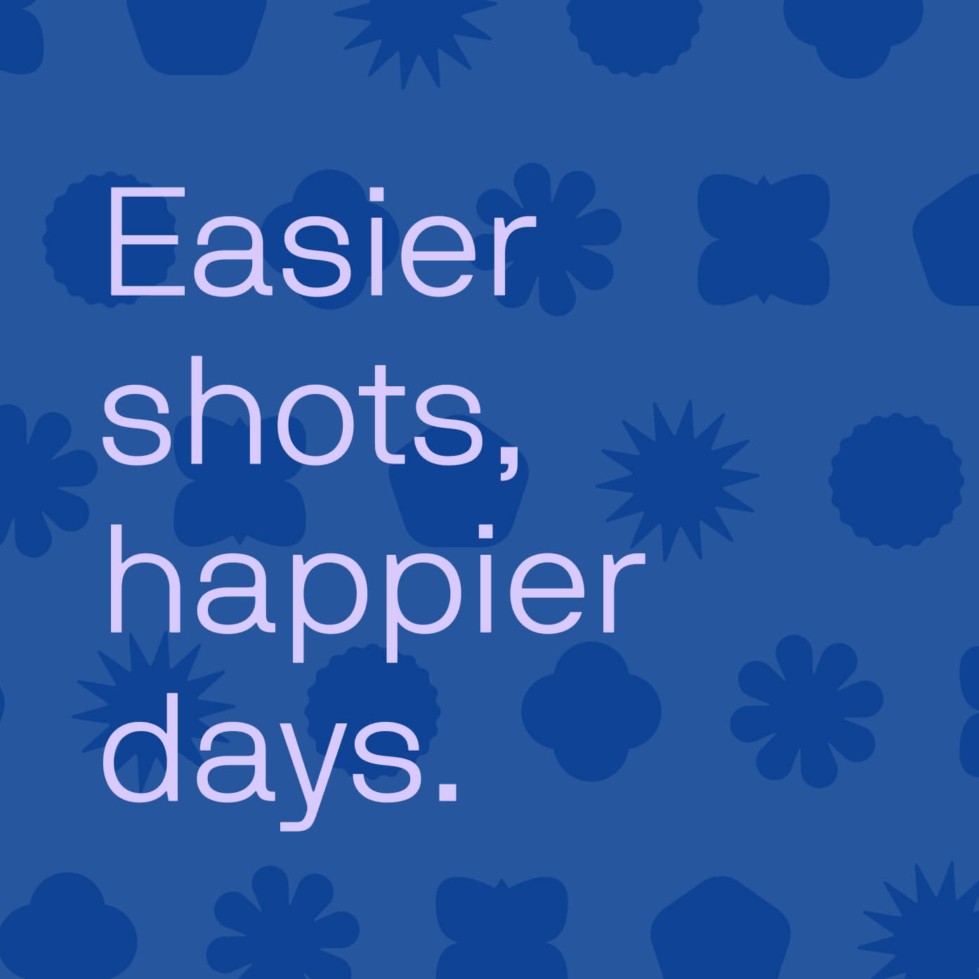
Thimble Taking the pain out of needles, one patch at a time. Client: Thimble is a physician-led startup aimed at alleviating needle fear, a common aversion affecting over 60% of people with soothing, compassionate brand experiences in healthcare. Category: Naming, Brand Identity, Packaging, Website, Strategy Role: Senior Designer Team: Season Studio Project Overview Thimble sought to transform a universal source of anxiety into something calming and approachable. We named and shaped their brand identity to evoke safety and comfort branding that feels gentle, optimistic, and completely free of sharp edges. The full suite spanned packaging, website, and marketing materials to support their pre-launch rollout. Design Thinking Our goal was to craft a brand that felt as gentle and empathetic as Thimble’s mission. We began by developing a name that communicates both care and protection, “Thimble” evokes a familiar tool used to guard against sharp points, making it the perfect metaphor for their needle-alternative product. From there, we built a visual identity centered around softness: rounded forms, muted contrasts, and approachable typography, all free of sharp edges, ensuring every touchpoint eased anxiety rather than triggered it. This identity extended seamlessly across packaging, digital, and event collateral, helping Thimble launch with a brand that breaks from sterile healthcare norms and instead feels human, warm, and calming. The outcome was a cohesive system that positioned Thimble as a trusted, compassionate innovator in health tech. One that speaks directly to the emotional experience of its users.
Thimble
Direction, Digital
,
2023
Thimble Taking the pain out of needles, one patch at a time. Client: Thimble is a physician-led startup aimed at alleviating needle fear, a common aversion affecting over 60% of people with soothing, compassionate brand experiences in healthcare. Category: Naming, Brand Identity, Packaging, Website, Strategy Role: Senior Designer Team: Season Studio Project Overview Thimble sought to transform a universal source of anxiety into something calming and approachable. We named and shaped their brand identity to evoke safety and comfort branding that feels gentle, optimistic, and completely free of sharp edges. The full suite spanned packaging, website, and marketing materials to support their pre-launch rollout. Design Thinking Our goal was to craft a brand that felt as gentle and empathetic as Thimble’s mission. We began by developing a name that communicates both care and protection, “Thimble” evokes a familiar tool used to guard against sharp points, making it the perfect metaphor for their needle-alternative product. From there, we built a visual identity centered around softness: rounded forms, muted contrasts, and approachable typography, all free of sharp edges, ensuring every touchpoint eased anxiety rather than triggered it. This identity extended seamlessly across packaging, digital, and event collateral, helping Thimble launch with a brand that breaks from sterile healthcare norms and instead feels human, warm, and calming. The outcome was a cohesive system that positioned Thimble as a trusted, compassionate innovator in health tech. One that speaks directly to the emotional experience of its users.

THMBL_01.JPG
THMBL_01.JPG

THMBL_02.MP4
THMBL_02.MP4
THMBL_03.JPG
THMBL_03.JPG
THMBL_04.JPG
THMBL_04.JPG
THMBL_05.JPG
THMBL_05.JPG

THMBL_06.MP4
THMBL_06.MP4
THMBL_07.JPG
THMBL_07.JPG

THMBL_08.JPG
THMBL_08.JPG
Summit
Identity, Direction
,
2024
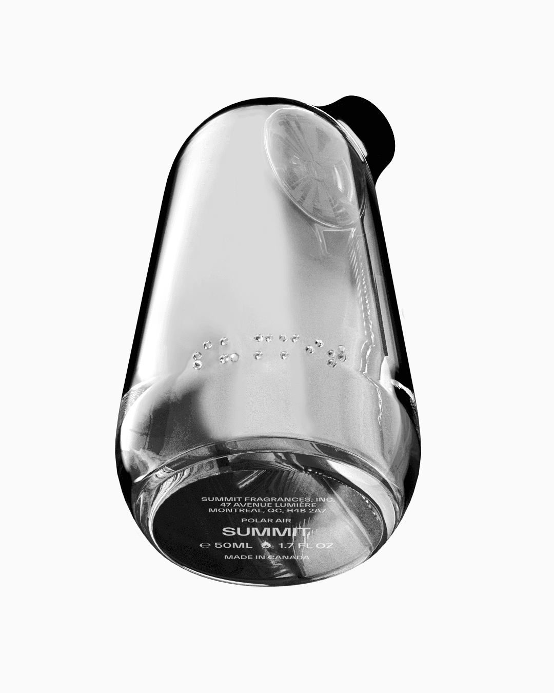
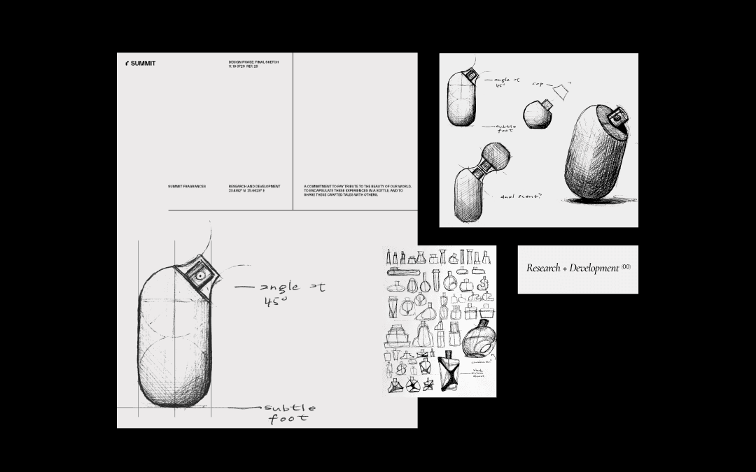
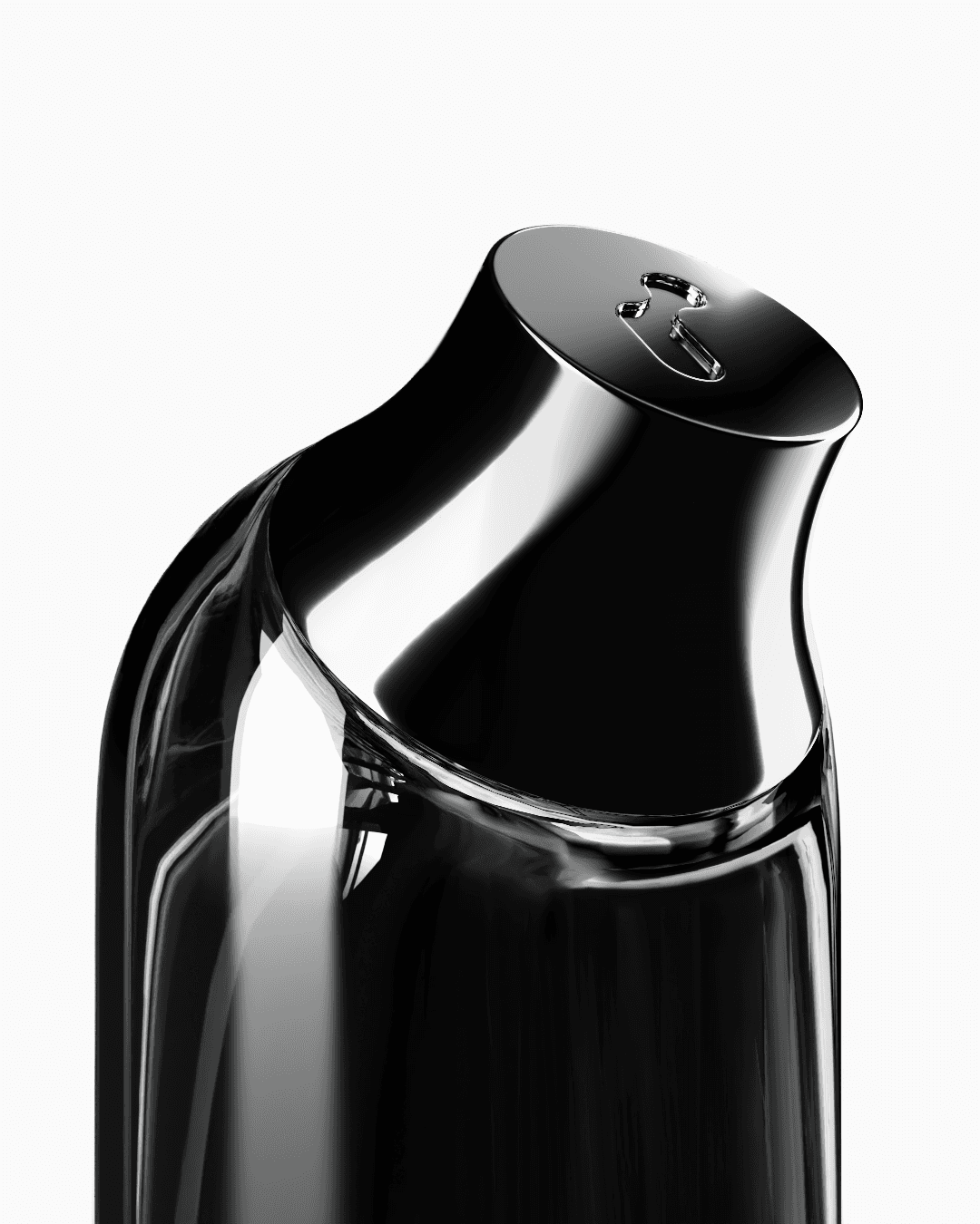
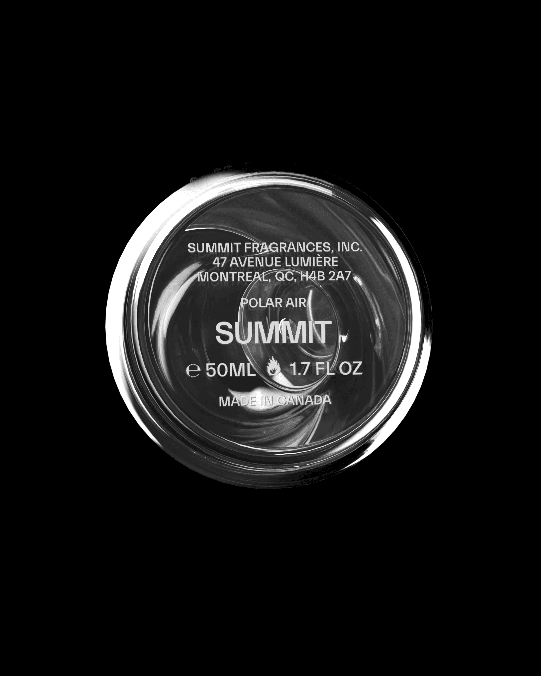
Summit Fragrances The new olfactory language. Client: Summit Fragrances Category: Brand Development, Creative Direction, Campaign Development, Digital Design Role: Lead Designer, Brand Strategist Team: Empty Cart Studios Project Overview Summit Fragrances approached us to help shape their market debut with a brand identity and campaign system that redefines modern luxury. Merging scent, science, and storytelling, they needed a visual system and direction that would capture the spirit of exploration while honoring their commitment to sustainability and sensory depth. Design Thinking Our approach was rooted in storytelling, sustainability, community, and inclusivity. Pillars that aligned with Summit’s vision of redefining luxury through scent. We developed a brand identity that seamlessly blended nature and science, using clean, modern design elements paired with tactile features like Braille to emphasize accessibility and deepen the sensory experience. The visual system was designed to be both flexible and expressive, capable of highlighting the individuality of each fragrance while maintaining a cohesive brand presence. This work culminated in a campaign that introduced Summit’s products as more than perfumes, they became vehicles of exploration and connection. The outcome was a distinctive brand launch that resonated with scent enthusiasts and modern consumers alike, establishing Summit Fragrances as a bold, inclusive voice in the future of fragrance.
Summit
Identity, Direction
,
2024
Summit Fragrances The new olfactory language. Client: Summit Fragrances Category: Brand Development, Creative Direction, Campaign Development, Digital Design Role: Lead Designer, Brand Strategist Team: Empty Cart Studios Project Overview Summit Fragrances approached us to help shape their market debut with a brand identity and campaign system that redefines modern luxury. Merging scent, science, and storytelling, they needed a visual system and direction that would capture the spirit of exploration while honoring their commitment to sustainability and sensory depth. Design Thinking Our approach was rooted in storytelling, sustainability, community, and inclusivity. Pillars that aligned with Summit’s vision of redefining luxury through scent. We developed a brand identity that seamlessly blended nature and science, using clean, modern design elements paired with tactile features like Braille to emphasize accessibility and deepen the sensory experience. The visual system was designed to be both flexible and expressive, capable of highlighting the individuality of each fragrance while maintaining a cohesive brand presence. This work culminated in a campaign that introduced Summit’s products as more than perfumes, they became vehicles of exploration and connection. The outcome was a distinctive brand launch that resonated with scent enthusiasts and modern consumers alike, establishing Summit Fragrances as a bold, inclusive voice in the future of fragrance.

SUM_01.JPG
SUM_01.JPG

SUM_02.JPG
SUM_02.JPG
SUM_03.JPG
SUM_03.JPG
SUM_04.JPG
SUM_04.JPG

SUM_05.JPG
SUM_05.JPG
SUM_06.JPG
SUM_06.JPG

SUM_07.JPG
SUM_07.JPG
SUM_08.JPG
SUM_08.JPG
KemTech
Identity, Digital, Copy
,
2020
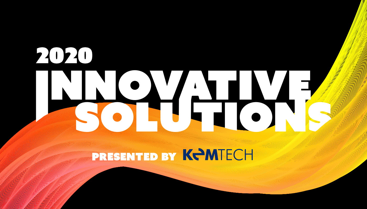
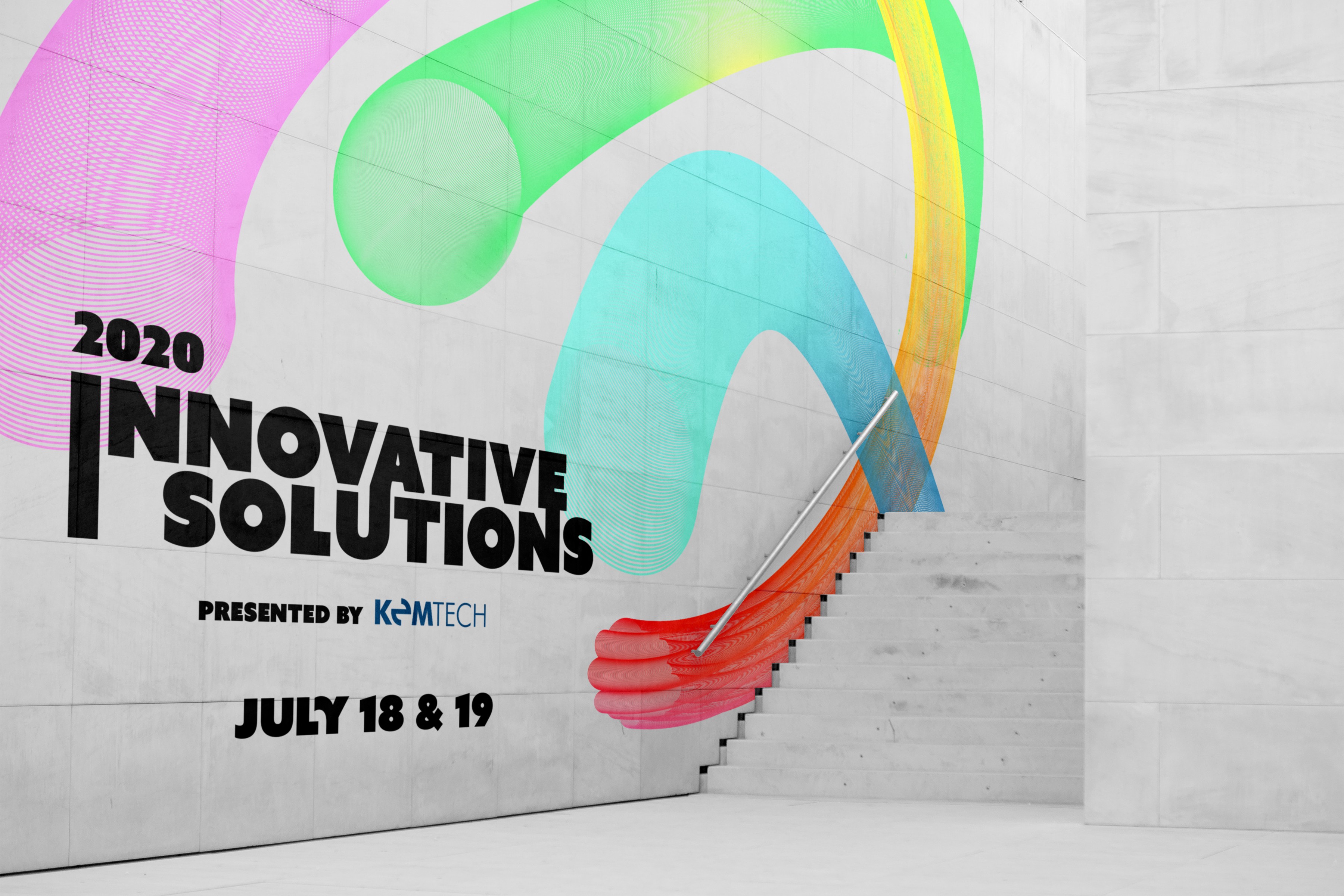
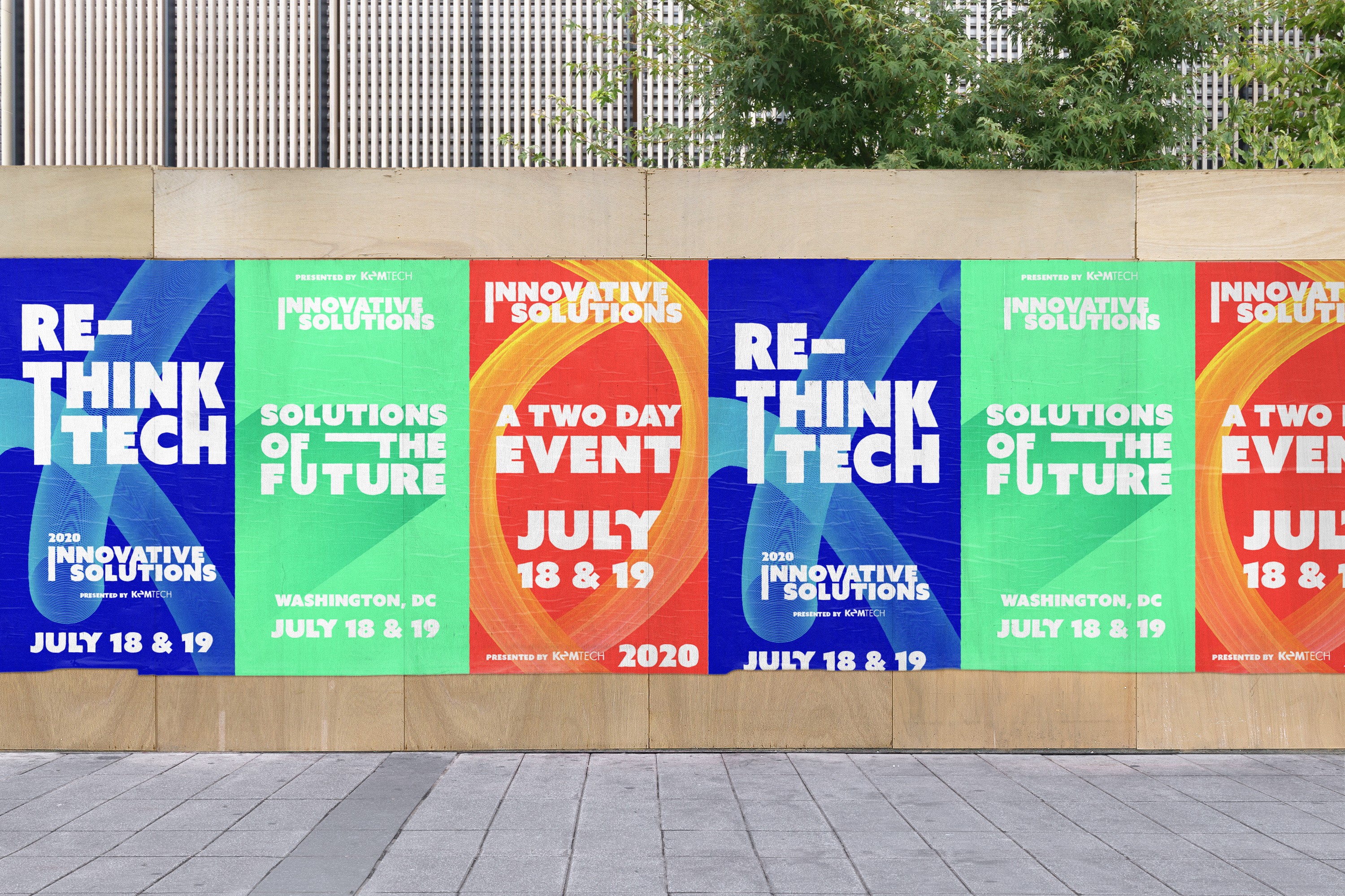
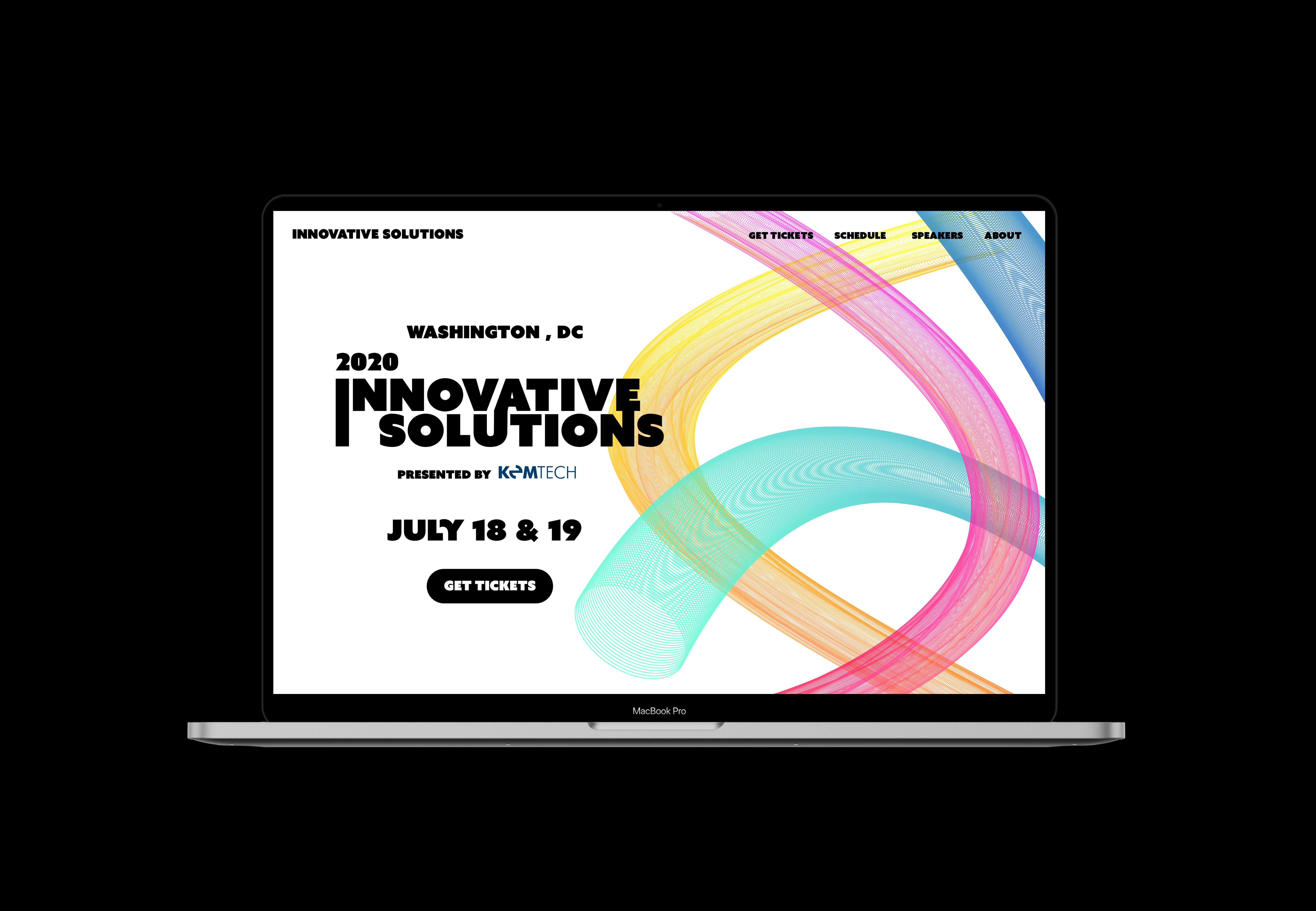
KemTech Innovative Solutions: Reimagining the future of tech through creativity, design, and STEM. Client: KemTechnology is a forward-thinking tech company specializing in IT, security, and cloud solutions for government and enterprise. Category: Concept Development, Brand Identity, Visual System, Copy Role: Lead Designer Team: Kem Technology Project Overview Innovative Solutions is a conceptual two-day international event imagined for KemTechnology—a company rooted in tech, security, and innovation. Hosted in Washington, D.C., the event was designed to spark cross disciplinary dialogue around the most pressing challenges in technology today, from accessibility to digital equity, and to explore how creativity and STEM can shape a more inclusive future. Design Thinking I developed a full event identity and visual system to reflect the intersection of innovation, imagination, and impact. The branding leaned into bold typography, modular layouts, and a vibrant, tech forward color palette that could scale across print, digital, and environmental applications. The goal was to position the event not as another industry conference, but as a creative catalyst. a space where designers, technologists, and changemakers could come together to ideate real world solutions. By crafting a cohesive narrative and visual identity for Innovative Solutions, I demonstrated how KemTechnology could expand its presence beyond B2B services and step into a thought leadership role connecting their brand to larger conversations around the future of tech, equity, and access.
KemTech
Identity, Digital, Copy
,
2020
KemTech Innovative Solutions: Reimagining the future of tech through creativity, design, and STEM. Client: KemTechnology is a forward-thinking tech company specializing in IT, security, and cloud solutions for government and enterprise. Category: Concept Development, Brand Identity, Visual System, Copy Role: Lead Designer Team: Kem Technology Project Overview Innovative Solutions is a conceptual two-day international event imagined for KemTechnology—a company rooted in tech, security, and innovation. Hosted in Washington, D.C., the event was designed to spark cross disciplinary dialogue around the most pressing challenges in technology today, from accessibility to digital equity, and to explore how creativity and STEM can shape a more inclusive future. Design Thinking I developed a full event identity and visual system to reflect the intersection of innovation, imagination, and impact. The branding leaned into bold typography, modular layouts, and a vibrant, tech forward color palette that could scale across print, digital, and environmental applications. The goal was to position the event not as another industry conference, but as a creative catalyst. a space where designers, technologists, and changemakers could come together to ideate real world solutions. By crafting a cohesive narrative and visual identity for Innovative Solutions, I demonstrated how KemTechnology could expand its presence beyond B2B services and step into a thought leadership role connecting their brand to larger conversations around the future of tech, equity, and access.
IA_01.JPG
IA_01.JPG

IA_02.MP4
IA_02.MP4
IA_03.MP4
IA_03.MP4

IA_04.MP4
IA_04.MP4

IA_05.MP4
IA_05.MP4

IA_06.JPG
IA_06.JPG
IA_07.MP4
IA_07.MP4
IA_08.MP4
IA_08.MP4